Matplotlib学习笔记

介绍
Matplotlib 是 Python 的绘图库,它能让使用者很轻松地将数据图形化,并且提供多样化的输出格式。可以用来绘制各种静态,动态,交互式的图表。是一个非常强大的 Python 画图工具,我们可以使用该工具将很多数据通过图表的形式更直观的呈现出来。可以绘制线图、散点图、等高线图、条形图、柱状图、3D 图形、甚至是图形动画等等。
应用
Matplotlib 通常与 NumPy 和 SciPy(Scientific Python)一起使用, 这种组合广泛用于替代 MatLab,是一个强大的科学计算环境,有助于我们通过 Python 学习数据科学或者机器学习。
SciPy 是一个开源的 Python 算法库和数学工具包。
SciPy 包含的模块有最优化、线性代数、积分、插值、特殊函数、快速傅里叶变换、信号处理和图像处理、常微分方程求解和其他科学与工程中常用的计算。
安装
本章节,我们使用 pip 工具来安装 Matplotlib 库,如果还未安装该工具,可以参考 Python pip 安装与使用。
升级 pip:
1 | python3 -m pip install -U pip |
安装 matplotlib 库:
1 | python3 -m pip install -U matplotlib |
安装完成后,我们就可以通过 import 来导入matplotlib 库:
import matplotlib
以下实例,我们通过导入 matplotlib 库,然后查看 matplotlib库的版本号:
实例1:
import matplotlib
print(matplotlib.__version__)
执行以上代码,输出结果如下:
1 | 3.4.2 |
Matplotlib Pyplot
Pyplot 是 Matplotlib 的子库,提供了和 MATLAB 类似的绘图 API。
Pyplot 是常用的绘图模块,能很方便让用户绘制 2D 图表。
Pyplot 包含一系列绘图函数的相关函数,每个函数会对当前的图像进行一些修改,例如:给图像加上标记,生新的图像,在图像中产生新的绘图区域等等。
使用的时候,我们可以使用 import 导入 pyplot 库,并设置一个别名plt:
import matplotlib.pyplot as plt
这样我们就可以使用 plt 来引用 Pyplot 包的方法。
以下实例,我们通过两个坐标 (0,0) 到 (6,100) 来绘制一条线:
实例1:
1 | import matplotlib.pyplot as plt |
输出结果如下:

以上实例中我们使用了 Pyplot 的plot() 函数, plot() 函数是绘制二维图形的最基本函数。
plot() 用于画图它可以绘制点和线,语法格式如下:
1 | # 画单条线 |
参数说明:
- x, y:点或线的节点,x 为 x 轴数据,y 为 y 轴数据,数据可以列表或数组。
- fmt:可选,定义基本格式(如颜色、标记和线条样式)。
- \kwargs:可选,用在二维平面图上,设置指定属性,如标签,线的宽度等。
1 | plot(x, y) # 创建 y 中数据与 x 中对应值的二维线图,使用默认样式 |
颜色字符:‘b’ 蓝色,’m’ 洋红色,’g’ 绿色,’y’ 黄色,’r’ 红色,’k’ 黑色,’w’ 白色,’c’ 青绿色,’#008000’ RGB 颜色符串。多条曲线不指定颜色时,会自动选择不同颜色。
线型参数:‘‐’ 实线,’‐‐’ 破折线,’‐.’ 点划线,’:’ 虚线。
标记字符:‘.’ 点标记,’,’ 像素标记(极小点),’o’ 实心圈标记,’v’ 倒三角标记,’^’ 上三角标记,’>’ 右三角标记,’<’ 左三角标记…等等。
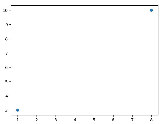
如果我们只想绘制两个坐标点,而不是一条线,可以使用 o 参数,表示一个实心圈的标记。
实例2:绘制坐标 (1, 3) 和 (8, 10) 的两个点
1 | import matplotlib.pyplot as plt |
我们也可以绘制任意数量的点,只需确保两个轴上的点数相同即可。
实例3:绘制一条不规则线,坐标为 (1, 3) 、 (2, 8) 、(6, 1) 、(8, 10),对应的两个数组为:[1, 2, 6, 8] 与 [3, 8, 1, 10]。
1 | import matplotlib.pyplot as plt |

实例4:如果我们不指定 x 轴上的点,y只限定范围。
1 | import matplotlib.pyplot as plt |

从上图可以看出 x 的值默认设置为 [0, 1]。
实例5:如果我们不指定 x 轴上的点,y表明具体的点,则 x 会根据 y 的值来设置为 0, 1, 2, 3..N-1
1 | import matplotlib.pyplot as plt |

实例6:以下实例我们绘制一个正弦和余弦图,在 plt.plot() 参数中包含两对 x,y 值,第一对是 x,y,这对应于正弦函数,第二对是 x,z,这对应于余弦函数。
1 | import matplotlib.pyplot as plt |

Matplotlib 绘图标记
绘图过程如果我们想要给坐标自定义一些不一样的标记,就可以使用 plot() 方法的 marker参数来定义。
实例1:定义实心圆标记
1 | import matplotlib.pyplot as plt |

marker可以定义的符号如下:
| 标记 | 符号 | 描述 | |
|---|---|---|---|
| “.” |  |
点 | |
| “,” |  |
像素点 | |
| “o” |  |
实心圆 | |
| “v” |  |
下三角 | |
| “^” |  |
上三角 | |
| “<” |  |
左三角 | |
| “>” |  |
右三角 | |
| “1” |  |
下三叉 | |
| “2” |  |
上三叉 | |
| “3” |  |
左三叉 | |
| “4” |  |
右三叉 | |
| “8” |  |
八角形 | |
| “s” |  |
正方形 | |
| “p” |  |
五边形 | |
| “P” |  |
加号(填充) | |
| “*” |  |
星号 | |
| “h” |  |
六边形 1 | |
| “H” |  |
六边形 2 | |
| “+” |  |
加号 | |
| “x” |  |
乘号 x | |
| “X” |  |
乘号 x (填充) | |
| “D” |  |
菱形 | |
| “d” |  |
瘦菱形 | |
| “\ | “ |  |
竖线 |
| “_” |  |
横线 | |
| 0 (TICKLEFT) |  |
左横线 | |
| 1 (TICKRIGHT) |  |
右横线 | |
| 2 (TICKUP) |  |
上竖线 | |
| 3 (TICKDOWN) |  |
下竖线 | |
| 4 (CARETLEFT) |  |
左箭头 | |
| 5 (CARETRIGHT) |  |
右箭头 | |
| 6 (CARETUP) |  |
上箭头 | |
| 7 (CARETDOWN) |  |
下箭头 | |
| 8 (CARETLEFTBASE) |  |
左箭头 (中间点为基准) | |
| 9 (CARETRIGHTBASE) |  |
右箭头 (中间点为基准) | |
| 10 (CARETUPBASE) |  |
上箭头 (中间点为基准) | |
| 11 (CARETDOWNBASE) |  |
下箭头 (中间点为基准) | |
| “None”, “ “ or “” | 没有任何标记 | ||
| ‘$…$’ |  |
渲染指定的字符。例如 “$f$” 以字母 f 为标记。 |
实例2:定义了 * 标记
1 | import matplotlib.pyplot as plt |

实例3:定义下箭头
1 | import matplotlib.pyplot as plt |

fmt 参数
fmt 参数定义了基本格式,如标记、线条样式和颜色。
1 | fmt = '[marker][line][color]' |
例如 o:r,o 表示实心圆标记,: 表示虚线,r 表示颜色为红色。
实例4:
1 | import matplotlib.pyplot as plt |

线类型:
| 线类型标记 | 描述 |
|---|---|
| ‘-‘ | 实线 |
| ‘:’ | 虚线 |
| ‘—‘ | 破折线 |
| ‘-.’ | 点划线 |
颜色类型:
| 颜色标记 | 描述 |
|---|---|
| ‘r’ | 红色 |
| ‘g’ | 绿色 |
| ‘b’ | 蓝色 |
| ‘c’ | 青色 |
| ‘m’ | 品红 |
| ‘y’ | 黄色 |
| ‘k’ | 黑色 |
| ‘w’ | 白色 |
标记大小和颜色
我们可以自定义标记的大小与颜色,使用的参数分别是:
- markersize,简写为 ms:定义标记的大小。
- markerfacecolor,简写为 mfc:定义标记内部的颜色。
- markeredgecolor,简写为 mec:定义标记边框的颜色。
实例5:设置标记大小
1 | import matplotlib.pyplot as plt |

实例6:设置标记外边框颜色
1 | import matplotlib.pyplot as plt |

实例7:设置标记内部颜色
1 | import matplotlib.pyplot as plt |

实例8:自定义标记内部与边框的颜色
1 | import matplotlib.pyplot as plt |

Matplotlib 绘图线
绘图过程如果我们自定义线的样式,包括线的类型、颜色和大小等。
线的类型
线的类型可以使用 linestyle 参数来定义,简写为 ls
| 类型 | 简写 | 说明 |
|---|---|---|
| ‘solid’ (默认) | ‘-‘ | 实线 |
| ‘dotted’ | ‘:’ | 点虚线 |
| ‘dashed’ | ‘—‘ | 破折线 |
| ‘dashdot’ | ‘-.’ | 点划线 |
| ‘None’ | ‘’ 或 ‘ ‘ | 不画线 |
实例1:
1 | import matplotlib.pyplot as plt |

实例2:使用简写
1 | import matplotlib.pyplot as plt |

线的颜色
线的颜色可以使用 color 参数来定义,简写为 c。
颜色类型:
| 颜色标记 | 描述 |
|---|---|
| ‘r’ | 红色 |
| ‘g’ | 绿色 |
| ‘b’ | 蓝色 |
| ‘c’ | 青色 |
| ‘m’ | 品红 |
| ‘y’ | 黄色 |
| ‘k’ | 黑色 |
| ‘w’ | 白色 |
当然也可以自定义颜色类型,例如:SeaGreen、#8FBC8F 等,完整样式可以参考 HTML 颜色值。
实例3:
1 | import matplotlib.pyplot as plt |

实例4:
1 | import matplotlib.pyplot as plt |

实例5:
1 | import matplotlib.pyplot as plt |

线的宽度
线的宽度可以使用 linewidth 参数来定义,简写为 lw,值可以是浮点数,如:1、2.0、5.67 等
实例6:
1 | import matplotlib.pyplot as plt |

多条线
plot() 方法中可以包含多对 x,y 值来绘制多条线。
实例7:
1 | import matplotlib.pyplot as plt |
从上图可以看出 x 的值默认设置为 [0, 1, 2, 3]。

实例8:
1 | import matplotlib.pyplot as plt |

Matplotlib 轴标签和标题
我们可以使用 xlabel() 和 ylabel() 方法来设置 x 轴和 y 轴的标签。
实例1:
1 | import numpy as np |

标题
实例2:使用 title() 方法来设置标题:
1 | import numpy as np |

图像中文显示
Matplotlib 默认情况不支持中文,我们可以使用以下简单的方法来解决。
这里我们使用思源黑体,思源黑体是 Adobe 与 Google 推出的一款开源字体。
官网:https://source.typekit.com/source-han-serif/cn/
GitHub 地址:https://github.com/adobe-fonts/source-han-sans/tree/release/OTF/SimplifiedChinese
打开链接后,在里面选一个就好了:

你也可以在网盘下载: https://pan.baidu.com/s/10-w1JbXZSnx3Tm6uGpPGOw,提取码:**yxqu**。
可以下载个 OTF 字体,比如 SourceHanSansSC-Bold.otf,将该文件文件放在当前执行的代码文件中:
SourceHanSansSC-Bold.otf 文件放在当前执行的代码文件中。
实例3:
1 | import numpy as np |

此外,我们还可以使用系统的字体:
1 | from matplotlib import pyplot as plt |
打印出你的 font_manager 的 ttflist 中所有注册的名字,找一个看中文字体例如:STFangsong(仿宋),然后添加以下代码即可:
1 | plt.rcParams['font.family']=['STFangsong'] |
实例4::自定义字体的样式
1 | import numpy as np |

标题与标签的定位
title() 方法提供了 loc 参数来设置标题显示的位置,可以设置为: ‘left’, ‘right’, 和 ‘center’, 默认值为 ‘center’。
xlabel() 方法提供了 loc 参数来设置 x 轴显示的位置,可以设置为: ‘left’, ‘right’, 和 ‘center’, 默认值为 ‘center’。
ylabel() 方法提供了 loc 参数来设置 y 轴显示的位置,可以设置为: ‘bottom’, ‘top’, 和 ‘center’, 默认值为 ‘center’。
实例5:
1 | import numpy as np |

Matplotlib 网格线
我们可以使用 pyplot 中的 grid() 方法来设置图表中的网格线。
grid() 方法语法格式如下:
1 | matplotlib.pyplot.grid(b=None, which='major', axis='both', ) |
参数说明:
b:可选,默认为 None,可以设置布尔值,true 为显示网格线,false 为不显示,如果设置 **kwargs 参数,则值为 true。
which:可选,可选值有 ‘major’、’minor’ 和 ‘both’,默认为 ‘major’,表示应用更改的网格线。
axis:可选,设置显示哪个方向的网格线,可以是取 ‘both’(默认),’x’ 或 ‘y’,分别表示两个方向,x 轴方向或 y 轴方向。
\kwargs:可选,设置网格样式,可以是 color=’r’, linestyle=’-‘ 和 linewidth=2,分别表示网格线的颜色,样式和宽度。
实例1:添加一个简单的网格线,参数使用默认值
1 | import numpy as np |

实例2:添加一个简单的网格线,axis 参数使用 x,设置 x 轴方向显示网格线
1 | import numpy as np |

以下实例添加一个简单的网格线,并设置网格线的样式,格式如下:
1 | grid(color = 'color', linestyle = 'linestyle', linewidth = number) |
参数说明:
color:‘b’ 蓝色,’m’ 洋红色,’g’ 绿色,’y’ 黄色,’r’ 红色,’k’ 黑色,’w’ 白色,’c’ 青绿色,’#008000’ RGB 颜色符串。
linestyle:‘‐’ 实线,’‐‐’ 破折线,’‐.’ 点划线,’:’ 虚线。
linewidth:设置线的宽度,可以设置一个数字。
实例3:
1 | import numpy as np |

Matplotlib绘制多图
我们可以使用 pyplot 中的 subplot() 和 subplots() 方法来绘制多个子图。
subplot() 方法在绘图时需要指定位置,subplots() 方法可以一次生成多个,在调用时只需要调用生成对象的 ax 即可。
subplot
1 | subplot(nrows, ncols, index, **kwargs) |
以上函数将整个绘图区域分成 nrows 行和 ncols 列,然后从左到右,从上到下的顺序对每个子区域进行编号 1…N ,左上的子区域的编号为 1、右下的区域编号为 N,编号可以通过参数 index 来设置。
设置 numRows = 1,numCols = 2,就是将图表绘制成 1x2 的图片区域, 对应的坐标为:
1 | (1, 1), (1, 2) |
plotNum = 1, 表示的坐标为(1, 1), 即第一行第一列的子图。
plotNum = 2, 表示的坐标为(1, 2), 即第一行第二列的子图。
实例1:
1 | import matplotlib.pyplot as plt |

设置 numRows = 2,numCols = 2,就是将图表绘制成 2x2 的图片区域, 对应的坐标为:
1 | (1, 1), (1, 2) |
plotNum = 1, 表示的坐标为(1, 1), 即第一行第一列的子图。
plotNum = 2, 表示的坐标为(1, 2), 即第一行第二列的子图。
plotNum = 3, 表示的坐标为(2, 1), 即第二行第一列的子图。
plotNum = 4, 表示的坐标为(2, 2), 即第二行第二列的子图。
实例2:
1 | import matplotlib.pyplot as plt |

subplots()
subplots() 方法语法格式如下:
1 | matplotlib.pyplot.subplots(nrows=1, ncols=1, *, sharex=False, sharey=False, squeeze=True, subplot_kw=None, gridspec_kw=None, **fig_kw) |
参数说明:
- nrows:默认为 1,设置图表的行数。
- ncols:默认为 1,设置图表的列数。
- sharex、sharey:设置 x、y 轴是否共享属性,默认为 false,可设置为 ‘none’、’all’、’row’ 或 ‘col’。 False 或 none 每个子图的 x 轴或 y 轴都是独立的,True 或 ‘all’:所有子图共享 x 轴或 y 轴,’row’ 设置每个子图行共享一个 x 轴或 y 轴,’col’:设置每个子图列共享一个 x 轴或 y 轴。
- squeeze:布尔值,默认为 True,表示额外的维度从返回的 Axes(轴)对象中挤出,对于 N1 或 1N 个子图,返回一个 1 维数组,对于 N*M,N>1 和 M>1 返回一个 2 维数组。如果设置为 False,则不进行挤压操作,返回一个元素为 Axes 实例的2维数组,即使它最终是1x1。
- subplot_kw:可选,字典类型。把字典的关键字传递给 add_subplot() 来创建每个子图。
- gridspec_kw:可选,字典类型。把字典的关键字传递给 GridSpec 构造函数创建子图放在网格里(grid)。
- \fig_kw:把详细的关键字参数传给 figure() 函数。
实例3:
1 | import matplotlib.pyplot as plt |


Matplotlib散点图
我们可以使用 pyplot 中的 scatter() 方法来绘制散点图。
scatter() 方法语法格式如下:
1 | matplotlib.pyplot.scatter(x, y, s=None, c=None, marker=None, cmap=None, norm=None, vmin=None, vmax=None, alpha=None, linewidths=None, *, edgecolors=None, plotnonfinite=False, data=None, **kwargs) |
参数说明:
x,y:长度相同的数组,也就是我们即将绘制散点图的数据点,输入数据。
s:点的大小,默认 20,也可以是个数组,数组每个参数为对应点的大小。
c:点的颜色,默认蓝色 ‘b’,也可以是个 RGB 或 RGBA 二维行数组。
marker:点的样式,默认小圆圈 ‘o’。
cmap:Colormap,默认 None,标量或者是一个 colormap 的名字,只有 c 是一个浮点数数组的时才使用。如果没有申明就是 image.cmap。
norm:Normalize,默认 None,数据亮度在 0-1 之间,只有 c 是一个浮点数的数组的时才使用。
vmin,vmax::亮度设置,在 norm 参数存在时会忽略。
alpha::透明度设置,0-1 之间,默认 None,即不透明。
linewidths::标记点的长度。
edgecolors::颜色或颜色序列,默认为 ‘face’,可选值有 ‘face’, ‘none’, None。
plotnonfinite::布尔值,设置是否使用非限定的 c ( inf, -inf 或 nan) 绘制点。
\kwargs::其他参数。
以下实例 scatter() 函数接收长度相同的数组参数,一个用于 x 轴的值,另一个用于 y 轴上的值:
实例1:
1 | import matplotlib.pyplot as plt |

实例2:设置图标大小
1 | import matplotlib.pyplot as plt |

实例3:自定义点的颜色
1 | import matplotlib.pyplot as plt |

实例4:设置两组散点图
1 | import matplotlib.pyplot as plt |

实例5:使用随机数来设置散点图
1 | import numpy as np |

颜色条Colormap
Matplotlib 模块提供了很多可用的颜色条。
颜色条就像一个颜色列表,其中每种颜色都有一个范围从 0 到 100 的值。
下面是一个颜色条的例子:

实例6:设置颜色条需要使用 cmap 参数,默认值为 ‘viridis’,之后颜色值设置为 0 到 100 的数组
1 | import matplotlib.pyplot as plt |

实例7:如果要显示颜色条,需要使用 plt.colorbar() 方法
1 | import matplotlib.pyplot as plt |

实例8:换个颜色条参数, cmap 设置为 afmhot_r
1 | import matplotlib.pyplot as plt |

颜色条参数值可以是以下值:
| 颜色名称 | 保留关键字 |
|---|---|
| Accent | Accent_r |
| Blues | Blues_r |
| BrBG | BrBG_r |
| BuGn | BuGn_r |
| BuPu | BuPu_r |
| CMRmap | CMRmap_r |
| Dark2 | Dark2_r |
| GnBu | GnBu_r |
| Greens | Greens_r |
| Greys | Greys_r |
| OrRd | OrRd_r |
| Oranges | Oranges_r |
| PRGn | PRGn_r |
| Paired | Paired_r |
| Pastel1 | Pastel1_r |
| Pastel2 | Pastel2_r |
| PiYG | PiYG_r |
| PuBu | PuBu_r |
| PuBuGn | PuBuGn_r |
| PuOr | PuOr_r |
| PuRd | PuRd_r |
| Purples | Purples_r |
| RdBu | RdBu_r |
| RdGy | RdGy_r |
| RdPu | RdPu_r |
| RdYlBu | RdYlBu_r |
| RdYlGn | RdYlGn_r |
| Reds | Reds_r |
| Set1 | Set1_r |
| Set2 | Set2_r |
| Set3 | Set3_r |
| Spectral | Spectral_r |
| Wistia | Wistia_r |
| YlGn | YlGn_r |
| YlGnBu | YlGnBu_r |
| YlOrBr | YlOrBr_r |
| YlOrRd | YlOrRd_r |
| afmhot | afmhot_r |
| autumn | autumn_r |
| binary | binary_r |
| bone | bone_r |
| brg | brg_r |
| bwr | bwr_r |
| cividis | cividis_r |
| cool | cool_r |
| coolwarm | coolwarm_r |
| copper | copper_r |
| cubehelix | cubehelix_r |
| flag | flag_r |
| gist_earth | gist_earth_r |
| gist_gray | gist_gray_r |
| gist_heat | gist_heat_r |
| gist_ncar | gist_ncar_r |
| gist_rainbow | gist_rainbow_r |
| gist_stern | gist_stern_r |
| gist_yarg | gist_yarg_r |
| gnuplot | gnuplot_r |
| gnuplot2 | gnuplot2_r |
| gray | gray_r |
| hot | hot_r |
| hsv | hsv_r |
| inferno | inferno_r |
| jet | jet_r |
| magma | magma_r |
| nipy_spectral | nipy_spectral_r |
| ocean | ocean_r |
| pink | pink_r |
| plasma | plasma_r |
| prism | prism_r |
| rainbow | rainbow_r |
| seismic | seismic_r |
| spring | spring_r |
| summer | summer_r |
| tab10 | tab10_r |
| tab20 | tab20_r |
| tab20b | tab20b_r |
| tab20c | tab20c_r |
| terrain | terrain_r |
| twilight | twilight_r |
| twilight_shifted | twilight_shifted_r |
| viridis | viridis_r |
| winter | winter_r |


Matplotlib柱形图
我们可以使用 pyplot 中的 bar() 方法来绘制柱形图。
bar() 方法语法格式如下:
1 | matplotlib.pyplot.bar(x, height, width=0.8, bottom=None, *, align='center', data=None, **kwargs) |
参数说明:
x:浮点型数组,柱形图的 x 轴数据。
height:浮点型数组,柱形图的高度。
width:浮点型数组,柱形图的宽度。
bottom:浮点型数组,底座的 y 坐标,默认 0。
align:柱形图与 x 坐标的对齐方式,’center’ 以 x 位置为中心,这是默认值。 ‘edge’:将柱形图的左边缘与 x 位置对齐。要对齐右边缘的条形,可以传递负数的宽度值及 align=’edge’。
\kwargs::其他参数。
实例1:简单实用 bar() 来创建一个柱形图
1 | import matplotlib.pyplot as plt |

实例2:垂直方向的柱形图可以使用 barh() 方法来设置
1 | import matplotlib.pyplot as plt |

实例3:设置柱形图颜色
1 | import matplotlib.pyplot as plt |

实例4:自定义各个柱形的颜色
1 | import matplotlib.pyplot as plt |

实例5:设置柱形图宽度,bar() 方法使用 width 设置
1 | import matplotlib.pyplot as plt |

实例6:barh() 方法使用 height 设置 height
1 | import matplotlib.pyplot as plt |

Matplotlib饼图
我们可以使用 pyplot 中的 pie() 方法来绘制饼图。
pie() 方法语法格式如下:
1 | matplotlib.pyplot.pie(x, explode=None, labels=None, colors=None, autopct=None, pctdistance=0.6, shadow=False, labeldistance=1.1, startangle=0, radius=1, counterclock=True, wedgeprops=None, textprops=None, center=0, 0, frame=False, rotatelabels=False, *, normalize=None, data=None)[source] |
参数说明:
x:浮点型数组,表示每个扇形的面积。
explode:数组,表示各个扇形之间的间隔,默认值为0。
labels:列表,各个扇形的标签,默认值为 None。
colors:数组,表示各个扇形的颜色,默认值为 None。
autopct:设置饼图内各个扇形百分比显示格式,%d%% 整数百分比,%0.1f 一位小数, %0.1f%% 一位小数百分比, %0.2f%% 两位小数百分比。
labeldistance:标签标记的绘制位置,相对于半径的比例,默认值为 1.1,如 <1则绘制在饼图内侧。
pctdistance::类似于 labeldistance,指定 autopct 的位置刻度,默认值为 0.6。
shadow::布尔值 True 或 False,设置饼图的阴影,默认为 False,不设置阴影。
radius::设置饼图的半径,默认为 1。
startangle::起始绘制饼图的角度,默认为从 x 轴正方向逆时针画起,如设定 =90 则从 y 轴正方向画起。
counterclock:布尔值,设置指针方向,默认为 True,即逆时针,False 为顺时针。
wedgeprops :字典类型,默认值 None。参数字典传递给 wedge 对象用来画一个饼图。例如:wedgeprops={‘linewidth’:5} 设置 wedge 线宽为5。
textprops :字典类型,默认值为:None。传递给 text 对象的字典参数,用于设置标签(labels)和比例文字的格式。
center :浮点类型的列表,默认值:(0,0)。用于设置图标中心位置。
frame :布尔类型,默认值:False。如果是 True,绘制带有表的轴框架。
rotatelabels :布尔类型,默认为 False。如果为 True,旋转每个 label 到指定的角度。
实例1:简单实用 pie() 来创建一个柱形图
1 | import matplotlib.pyplot as plt |

实例2:设置饼图各个扇形的标签与颜色
1 | import matplotlib.pyplot as plt |

实例3:突出显示第二个扇形,并格式化输出百分比
1 | import matplotlib.pyplot as plt |

注意:默认情况下,第一个扇形的绘制是从 x 轴开始并逆时针移动: